- MAIN PAGE
- – elvtr magazine – A beginner’s guide to creating an outstanding health & wellness product by Garmin’s design mastermind
A beginner’s guide to creating an outstanding health & wellness product by Garmin’s design mastermind

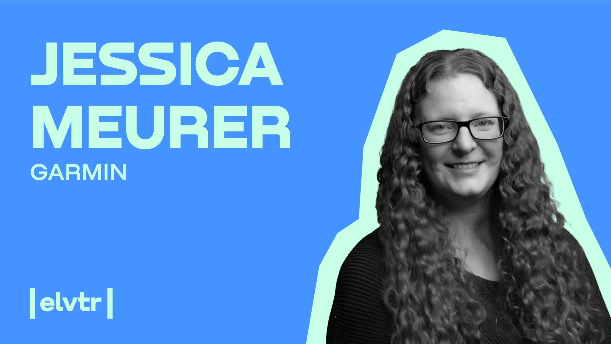
As lead product designer at Garmin, a wearable technology powerhouse, Jessica Meurer has designed products like Garmin Golf, Garmin Dive and the PacePro feature within Garmin Connect. A natural born creative, Jessica has also won a NASA hackathon for showing what the weather is like on Mars.
In advance of her ELVTR course on Health and Wellness Product Design, a must for designers who want to join the burgeoning health & wellness industry, she explains how to build a successful wellness product in nine steps, from the ideation process to the final prototype.
#1. Make your product a part of the user’s everyday life
Success is about the ease of incorporating the wellness product into a customer’s everyday life without noticing. Making it a part of their day-to-day routines without strong disruption is really important to these users. You don't want it to be a burden to them, as they're trying to make small changes in their livelihood.
#2. Put yourself in your customer's shoes
A user who’s just entering into the fitness world needs more guidance than someone who has been more exposed to the fitness world and has an idea of what they're looking for. At Garmin, we try to find that balance of giving users the information that is most useful to them.
We tailor features to different target groups, but always keep in mind a user who might use the feature for the very first time; hence content is very important.
There are times when some users don't quite understand it. So we do fine-tuning on how we use words to make content more user-friendly. The goal is to help them understand the complexity of technical terms. So we try to make our products approachable to anyone in the market.
#3. Keep an eye on your competitors
You must define your target audience, whether you are working on a feature mainly targeting a competitive athlete or someone more wellness-conscious. So we conduct competitor analysis where we try to find strengths and weaknesses, opportunities where we can approach and do better, and others that can be a threat for a feature that we're trying to plan for.
It’s important to know what your competitors are doing. You can see what steps they're taking. You don't know for sure if that’s the right track, but if you see multiple competitors doing something, you want to get into that field. So research tells you what steps you can take to that next level.
You can still do a competitor analysis, even for something that is completely brand new that you haven't seen in the market. There is usually a decent amount already out there. It could be one step away from what you want to do, but that can still inform you.
That leads into steps you need to take in terms of future planning to get your application up-and-running and also on how you want to grow your application.
#4. Experiment with various ideation techniques
Ideas can arise from brainstorming sessions to using existing products you have for quite some time. At Garmin, we work as a team when it comes to brainstorming, braindumping, storyboarding and user journey mapping. That is where we can poke holes if necessary and come up with solutions.
Storyboarding provides a visual narrative focused on the user's emotions and personal experience, so it’s much more situational.
Journey mapping gets more analytical in the sense that it describes the user's experience in steps, interactions and touchpoints, getting a comprehensive view of the interaction process.
Braindumping is similar to brainstorming. You are just getting anything that you have on your mind out and writing it down. Then you're reorganizing it to identify commonalities of your ideas that you put on paper. And then it's just a matter of whether it sticks or not.
Some of our ideas come from hackathons, which gives our team the ability to try out ideas that might have been put to a later phase because of a tight deadline. We want to be able to stretch the mind to see what is viable. And if something is viable, we can look at our timeline, and think how we can position it in the market.
As a lead designer, I help coordinate and get groups together, but also throw in my own ideas. So I'm not there just to facilitate, but also to keep us on a timeline and keep pace with our goals. You want to hear multiple voices during that process, not just your voice.
We then find commonalities as a team and pitch to our product owner or a stakeholder. They will ask questions back and forth on the pros and cons, for example about time: how long is it going to take to do something versus the other? What’s the impact? Is this going to help our users? Is this something new or just an addition? And that will in turn help us pick an idea to move forward.
#5.Use your customer’s voice to fix things
In some cases we have second thoughts, especially during testing. You have agreed upon an idea and then you get to the testing phase and the feedback tells you that it’s not working. So we go back to the drawing board and get through another set of brainstorming. How can we approach this in a way based on user feedback and move forward?
We work with our research team on this. Testing can range from having user testing where we have people come in or do virtual testing, depending on whether it’s app or device testing, to online users doing tree mapping. So they're trying to organize aspects they think are worth putting into an application and where they would bucket things.
We're trying to get an understanding of how users are thinking and how they would approach an application to find XYZ. What’s more, we have the ability to do surveys and phone interviews with that group. We can also beta test features, which allows us to get data on how users opted in or out. The user can also send direct feedback to us.
We have recently done beta testing for a feature and some of the feedback impacted how we designed an interaction with a portion of that design. We went back, analysed and reiterated, so the next release incorporated the new design. Then we got new and more positive user feedback from customers.
Users were lost on how or where to customize their homepage and the interaction of moving elements around on the screen. We had to look at the wording, so it was a matter of content design.
From an accessibility standpoint, our haptics weren't exactly right. It was doing additional haptics, which didn't make any sense and could confuse the user. It’s always useful to keep things simple.
#6. Incorporate your monetization model into the product early on
It's beneficial if you can recognise something that could be monetised, especially if you're creating a brand new app. If you have an existing one, you can look at certain features and see where it would make sense down the road to have a paywall.
There are cases where certain features were not monetized at the beginning and down the road the developers monetized a certain portion. So there was backlash from users who complained that they took something away when it was free before.
It's beneficial to recognize a monetization model early on, so then you can look where you can simplify things and what makes sense to be on that free level. And as you begin to add more information, then it can be beneficial to re-address if that addition should go behind a paywall because of the time it takes for your team to build it. It just proves that the resources that went into it are valid and that's why that paywall is there.
Sometimes you have to think through what makes sense. If you look at a feature across the whole board, you can see that it could potentially be broken down into multiple phases. You can see that if you pull things back, what exactly can be free and what not.
If there are more back-in calls that have to happen, content design and other things need to be added to keep that thing ongoing, then it makes sense to have it behind a paywall.
#7. Build a minimum viable product (MVP)
An MVP gets your idea out to the market ahead of your competitors. It contains your core features that your product needs to have to function and engage your users. It's important to recognize in your designs the parts that can be an MVP product while juggling a roadmap of deadlines.
This can be based on the approach of a feature throughout phases. If you can recognize that there's going to be tons of phases, you can get down to where's your baseline and that can be your MVP. That’s what is launched first.
Then as you look at your timeline, you can add the next phase. Or the next release could include the next two phases. But ultimately you want to get your application or your feature out there. You want to make sure that you are still ahead of the market.
Garmin was one of the first companies to put out there All Day Pulse Ox alongside competitors like Apple and a few others. You can see how that translates across. It's eye-opening because you can get instant feedback from users or reviewers. That can tell you if the product is gonna survive.
#8. Experiment with low and high fidelity prototypes
The distinction between low versus high fidelity prototypes is based on the outcomes you are looking for as a product designer. So low-fidelity can be something that is quick - you want to get a quick feel from your users and make sure this is what makes sense. It’s about the ability to iterate and have quick timing.
High fidelity prototypes lead towards more fine-tuned mock-ups, which gives the user the feeling of what that product could look like as you come close to delivery.
Testing at this level is valid. You can also get emotional responses from your testers.
So high fidelity prototypes take more time because you can create more interactions, whereas with low fidelity you just get your idea across.
#9. Keep an eye on trends like AI
AI can play a huge role. For example, it can help you come up with workout plans. I've tested it. It can create a yoga sequence or a mobility workout that focuses on shoulders. The question is how can we benefit from it and incorporate it into our work.
There's also going to be more iteration on how to take in heart rate and sleep information. We can also set better expectations in the mental health area. I have seen that over the years, especially since COVID, and how that has affected customers’ mental health.
Ultimately, anything that comes in the field needs to be easily incorporated and understandable to the user so that it doesn't interrupt their day-to-day life.


