- MAIN PAGE
- – elvtr magazine – DATA VISUALIZATION & THE POWER OF STORYTELLING
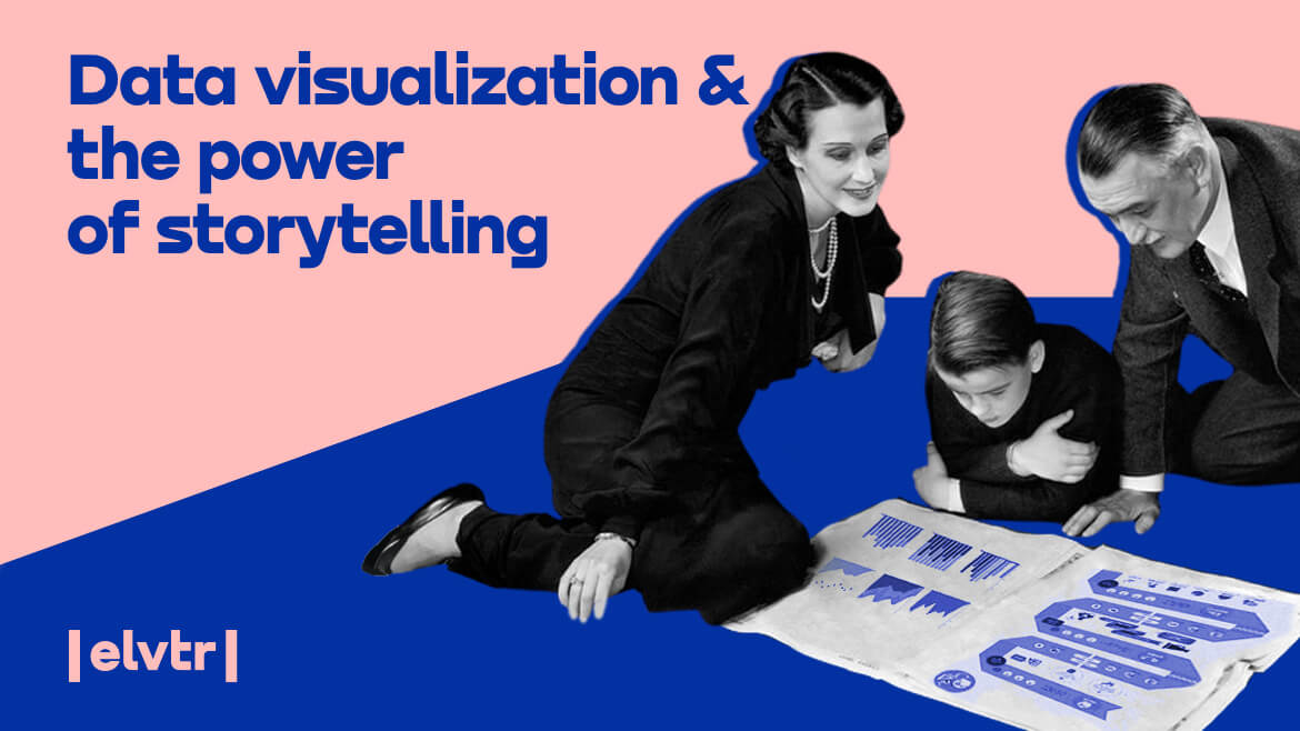
DATA VISUALIZATION & THE POWER OF STORYTELLING
How is Data Analyst defined?
If only data spoke for itself, you must have thought on many occasions while staring at a spreadsheet. Sadly, it doesn’t. Not for everyone, at least. However, there’s always a way out, and this time it’s a data visualization, a powerful way to tell a story from complex data.
According to Yuval Noah Harari’s theory, “storytelling is the essence of our survival.”
This Hebrew historian and philosopher states that the truly unique characteristic of human beings is the ability to create and believe in fiction. While animals use their means of communication to feel and describe reality, we create our own. The best possible example is money. Instead of exchanging goods, we invented paper bills that are realistically worthless and gave them the value we believe in.
Now how does this connect to staring at a spreadsheet and data visualization? It’s simple. Endless piles of data mean absolutely nothing to anyone. But once decoded and presented using data visualization tools, data can suddenly take the form of something like this:
Article’s content:
- Context of big data
- What is data visualization?
- Importance of data visualization
- How to get started?
- How to master data visualization?
Context of big data
Big data stands for XL quantity of diverse information that arrives in increasing volume, velocity, and variety. It can be structured, consisting of already managed data pre-stored in databases or spreadsheets, and expressed numerically. Or unstructured (messy), meaning that it is not pre-organized, modeled, or formatted. This kind of data is usually gathered from different online sources in formats like publicly shared comments, emails, video, audio, etc.
Such amounts and varieties of data need proper handling. Otherwise, it’s useless. Although we already talked about data from the angle of a data analyst, there’s no harm in repeating that it’s not about how much data you have but how you use it.
The work of a data professional includes collection, storage, cleaning, organizing, presenting, and making conclusions and decisions. The presentation part means telling a simple story from complex data. This requires designing clean, visually compelling charts that help others understand the results. It is possible with the help of visualization analytics for big data.
What is data visualization?
Definition
A picture says more than a thousand words. A bunch of structured or unstructured data is too abstract to have any meaning by itself. If you want to make data meaningful, present it graphically. That’s data visualization – graphical representation of data.
Presenting data in the form of an image, map, or infographic makes it easier to identify patterns and understand difficult concepts. With today’s technology and various data management tools, it’s even possible to interact with data by changing parameters to see more details and create new insights.
The reason why it works has everything to do with the way our eyes and brain function. Every day we interpret our surroundings instantaneously just by looking around. Our eyes send information to our brain that makes metaphors to help us understand what we see. It’s the same with data visualization. Simple example: you feed raw data to a data visualization tool and end up with an informative illustration.
Still, data visualization is just one of the steps of the data science process. Plenty of “dirty” work must be done before translating data into a visual concept. However, visual translation of data enables arriving at conclusions and making recommendations.


Data visualization catalog
According to datavizcatalogue, there are five different basic ways to visualize data, and those include:Graphs (area graph, bar chart, histogram, population pyramid, bubble chart, etc.)
- Diagrams (arc diagram, flow chart, timeline, tree diagram, brainstorm, etc.)
- Tables (calendar, Gantt chart, heat map, stem & leaf plot, tally chart, etc.)
- Maps (bubble map, connection map, flow map, choropleth map, etc.)
- Other (pie chart, treemap, world cloud, pictogram chart, proportional area chart, etc.)
Disclosed types and methods are available in Excel as well as other more complex data visualization tools.
Tableau, for example, is a tool that is broadly used for business intelligence. Visualization in Tableau enables the creation of interactive graphs and charts in the form of dashboards and worksheets. With drag and drop options, it’s also quite a user-friendly piece of software. Basic awareness of all the types of graphs is enough to start using Tableau today.
Data visualization examples
Amazing things can be done by data visualization methods and advanced specialized tools. Illustrations similar to the one about the history of pandemics presented at the beginning of this article saw the light of day a few years back.
Check out the 25 best data visualizations of 2020.
Importance of data visualization
Benefits
Data analysis is essential for all fields where data exists – basically everywhere. For businesses and science, having quality information means being on the high ground. The latter is true because the whole point of data visualization is to:
- make complex information simple,
- have everyone on board,
- make informed decisions fast.
It would be challenging to quickly locate patterns, communicate findings, or interact with data without visualization. That’s why interactive data visualization tools make all the difference.
Here are only some of the specific benefits of data visualization:
- quick and effective communication of information in a universal manner,
- identification of areas that need attention or improvement,
- a better understanding of customer/employee behavior,
- making data more memorable for stakeholders,
- timely addressing problems or answering questions,
- experimenting with different scenarios by making slight adjustments,
- recognizing parameters that are highly correlated,
- the ability to focus on areas that are most likely to support goals achievement,
- getting an edge over the competition.
Business application of data visualization
Another good answer to why use data visualization is because it has many positive business applications:
- Sales and marketing: seeing traffic trends as a result of marketing efforts.
- Politics: mapping out political party attachment per city, county, or region.
- Healthcare: mapping out important health data and understanding how variables change over time or influence each other.
- Science: greater insight from experimental data than ever before.
- Finance: tracking the performance of investment decisions; analyzing price movements over time; displaying important information, e.g., securities, currencies, stocks, and commodities.
- Logistics: determining the best global shipping routes.
How to get started?
Preparation
So far, it’s clear that visual representations of data enable the translation of complex concepts into easy-to-grasp information. But how to actually get started? What type of technology do you need? How do you use it to your advantage?
Before implementing new technology, a little preparation won’t hurt. This can include:
- Knowing what kind of data you are dealing with (size, speed, and format).
- Deciding what you would like to visualize and communicate across.
- Getting to know your target audience and how they process visual information.
- Using such information to choose the optimal visuals and illustrations.
- Being loyal to keeping things simple and digestible.
- Remember to design in a way to keep users engaged.
Tools
Today there are probably hundreds of tools and applications that allow the creation of visualized data. Many of the tools are basic, but some stand out by their capabilities or user-friendliness. We choose our top 3:
TABLEAU
Tableau is a great data visualization solution. It comes in as a desktop app or a server and hosted online version. Data can be imported from various sources, including CSV files, Google Analytics, and Salesforce data. Also, output options include multiple chart formats and distinct mapping capabilities.
Another great thing about visualization in Tableau is the public version. It’s free and available for anyone looking to create data visualizations, such as journalists and individuals for personal use. Additionally, there is an extensive gallery of premade infographics and illustrations for use and inspiration.
INFOGRAM
Infogram is a drag-and-drop tool with a bunch of features, and it is suitable even for non-designers for marketing reports, infographics, social media posts, maps, dashboards, and more.
Visualizations can be exported into a number of formats such as PNG, JPG, GIF, PDF, HTML, and others. The significant advantage is the option to create interactive designs suitable for embedding into websites or apps.
CHARTBLOCKS
ChartBlocks claims that data can be imported from “anywhere” using their API, including live feeds. While this is great news, it also means a more complex system than other easier apps. On the bright side, the app allows for extensive customization of the final graphic, while designers can create nearly any kind of chart and make the creation responsive.
How to master data visualization?
And now, the hard part – mastering the art of data visualization. Actually, “how” is easy. It’s following through that really matters.
In any case, reading books and blogs or experimenting with different tools is always a good and honest do-it-yourself approach.
Nothing beats learning from professionals, though. This way, you can learn fast how to unlock value from data and present it clearly and engagingly. Choosing the right course can provide the hands-on experience of effective data visualization and storytelling. It’s all you need to jumpstart your data visualization learning adventure.