- MAIN PAGE
- – elvtr magazine – DATA VISUALIZATION TOOLS: HOW TO PRESENT DATA EFFECTIVELY AND MAKE IT MEANINGFUL
DATA VISUALIZATION TOOLS: HOW TO PRESENT DATA EFFECTIVELY AND MAKE IT MEANINGFUL
Extracting meaningful insights from complex datasets has become a crucial skill. With such a big choice of data visualization tools, navigating the options and choosing the right one can be overwhelming. However, by comparing the distinctive features and advantages of visualization tools, you can find a perfect match for yourself.
But it's not just about selecting the right tool; it's about creating a broader mindset of data visualization. While the tools we explore in this article are powerful aids, the true strength lies in the hands of those who use them. Visualization tools will be more useful after users learn the fundamental principles, explore different techniques, and hone their visualization skills.
In this article, we will explore the 10 most popular data visualization tools: From the user-friendly interfaces of Tableau and Google Charts to the advanced data modeling capabilities of Looker and Sisense. We will discuss each tool's strengths, weaknesses, and unique features.
1. Tableau
Tableau is a popular data visualization tool that enables users to create interactive charts, graphs, and dashboards with different visuals. It offers a drag-and-drop interface, allowing users to analyze and present data from various sources easily.
Unique features:
- Interactive storytelling. Tableau allows users to create compelling data stories by combining visualizations and narratives into interactive dashboards.
- Natural language processing. It offers a feature called "Ask Data," which allows users to query data using natural language queries.
- Tableau Public. Users can publish visualizations to Tableau Public, a platform where anyone can explore and interact with public datasets.
Advantages:
- Intuitive user interface with a wide range of visualizations.
- Robust data connectivity to multiple sources.
- Powerful analytics capabilities, including advanced calculations and statistical functions.
- Collaboration features for sharing and publishing visualizations.
- Active user community with extensive support and resources.
Disadvantages:
- Expensive licensing costs for the full version.
- A steep learning curve for advanced features and complex data manipulations.
- Limited customization options for visual elements.
- Performance issues when dealing with large datasets.
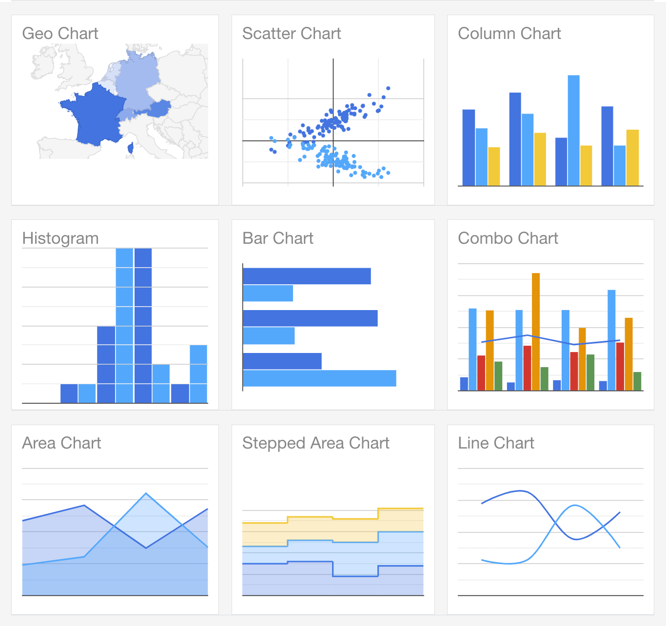
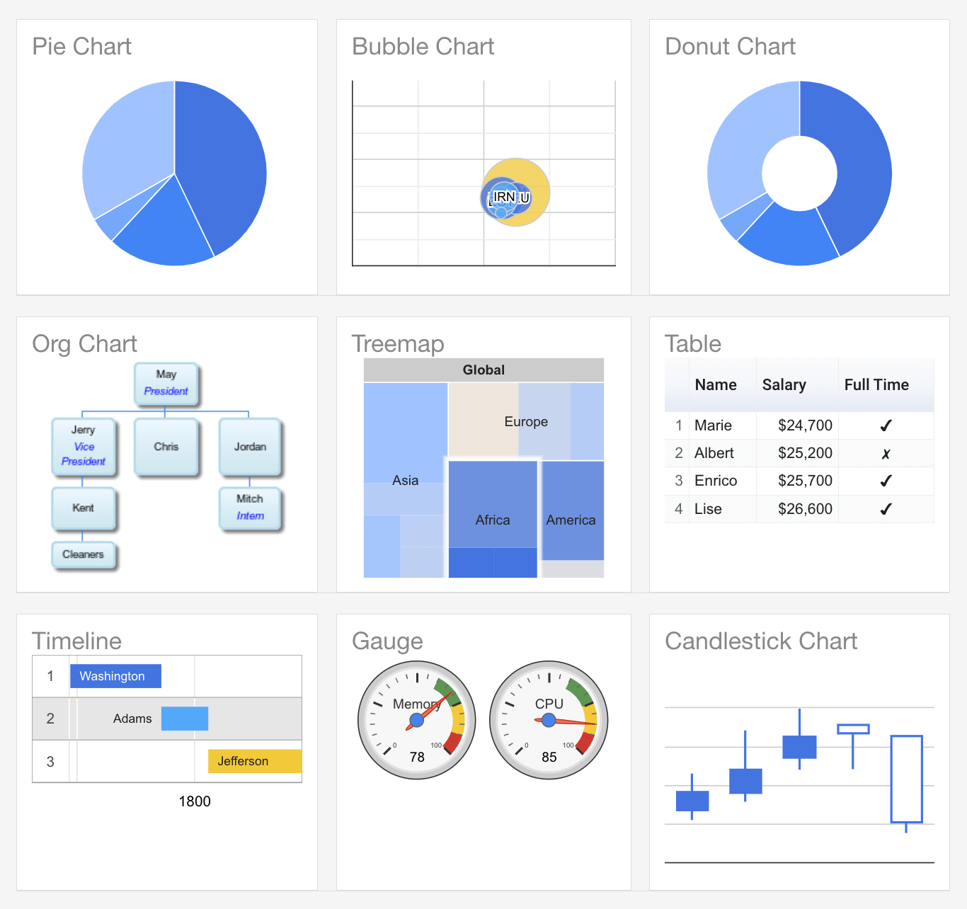
2. Google Charts
Google Charts is a free web-based tool that allows users to create interactive charts and visualizations using JavaScript. It provides a straightforward way to display data on websites and web applications.
Unique features:
- Google Sheets integration. Google Charts seamlessly integrates with Google Sheets, allowing users to create charts directly from their spreadsheet data.
- Geographical visualizations. It provides specialized charts for visualizing geographical data, such as maps and geocharts.
- Real-time collaboration. Multiple users can work on a chart simultaneously, making it convenient for team collaboration.
Advantages:
- Easy integration with other Google products.
- Simple and user-friendly interface.
- Supports a variety of chart types and customization options.
- Automatic handling of data formatting and scaling.
- Responsive and mobile-friendly visualizations.
Disadvantages:
- Less advanced features and customization compared to other tools.
- Relies on JavaScript programming for complex visualizations.
- Dependency on an internet connection and Google services.
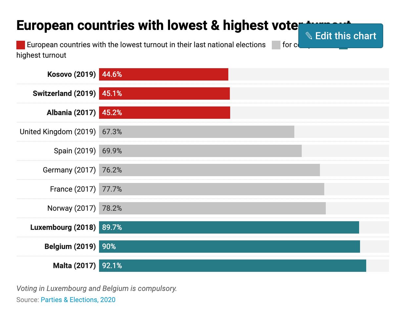
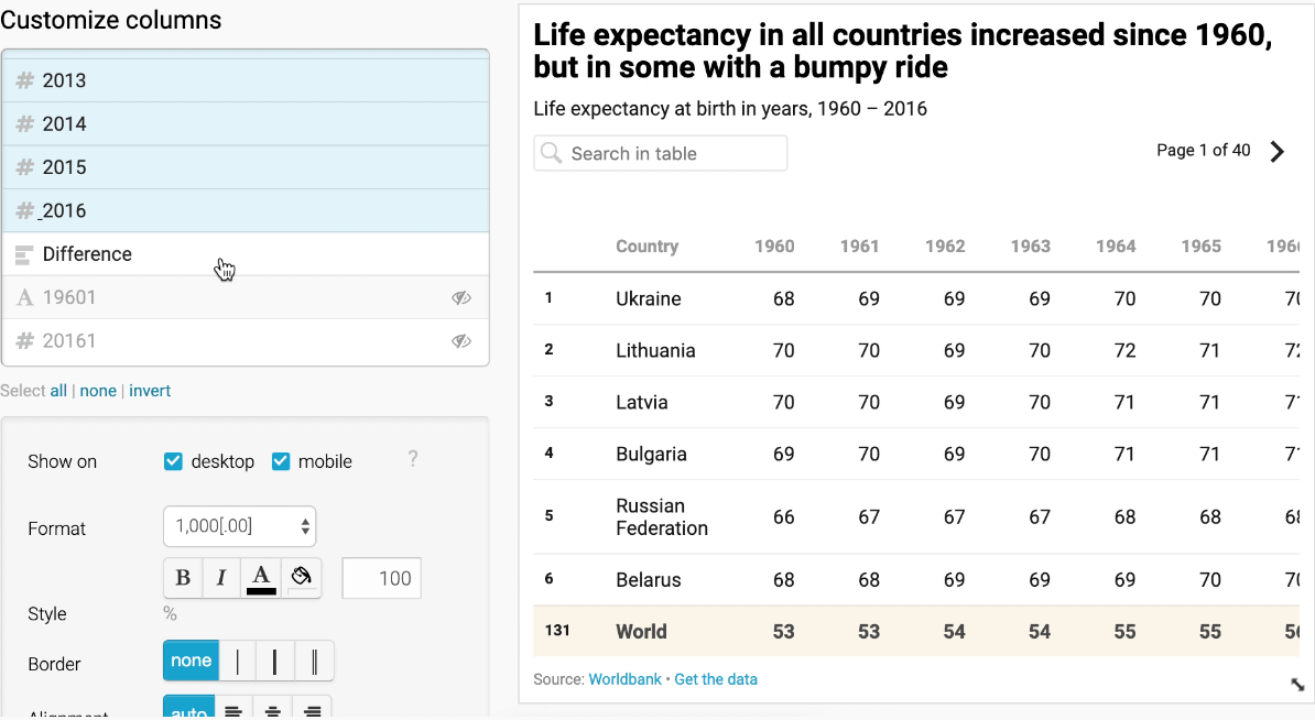
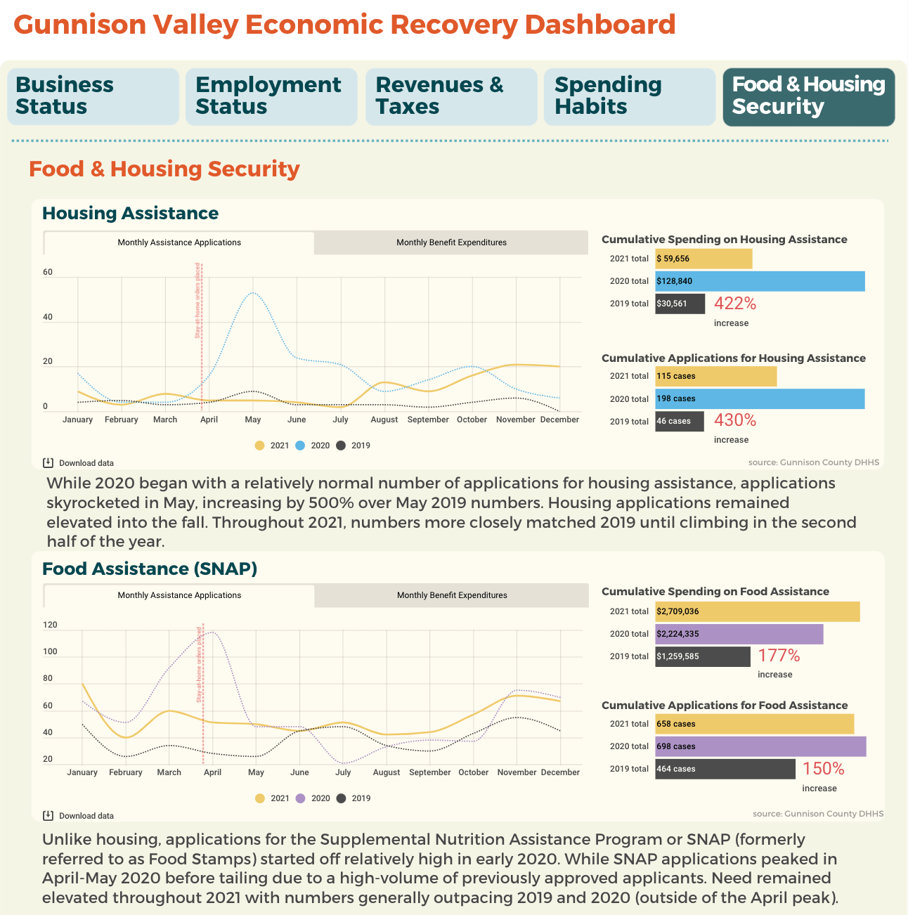
3. Datawrapper
Datawrapper is a data visualization tool specializing in creating interactive, customizable dashboards. It allows users to connect to various data sources, clean and transform data, and build visually appealing dashboards.
Unique features:
- Data cleaning and transformation. Datawrapper offers advanced data cleaning and transformation capabilities, allowing users to preprocess and shape their data.
- Customizable data connectors. Users can create custom connectors to access data from unique or proprietary sources.
- On-premises deployment. Wrapper provides the option for on-premises deployment, ensuring data security and compliance for organizations with strict data regulations.
Advantages:
- Extensive data source connectivity, including databases and APIs.
- Powerful data cleaning and transformation capabilities.
- Highly customizable dashboards with a drag-and-drop interface.
- Collaboration features for sharing and embedding dashboards.
- Offers both cloud-based and on-premises deployment options.
Disadvantages:
- Relatively smaller user base and community support compared to other tools.
- Limited out-of-the-box visualizations and chart types.
- Some advanced features may require programming knowledge.
4. Infogram
Infogram is an online tool for creating infographics and interactive visualizations. It provides a user-friendly interface with pre-designed templates and customization options.
Unique features:
- Infographic creation. Infogram focuses on creating infographics with pre-designed templates and various customizable visual elements.
- Social media sharing. Infogram allows users to easily share their visualizations on social media platforms or embed them on websites.
- Analytics tracking. It provides analytics tracking to monitor the performance and engagement of shared visualizations.
Advantages:
- Easy-to-use interface with drag-and-drop functionality.
- Extensive library of templates and visual elements.
- Real-time collaboration for team projects.
- Supports various data import options.
- Offers sharing and embedding options.
Disadvantages:
- Limited advanced analytics and data manipulation capabilities.
- Templates can be restrictive for advanced customization.
- The free version has limitations, and advanced features require a paid subscription.


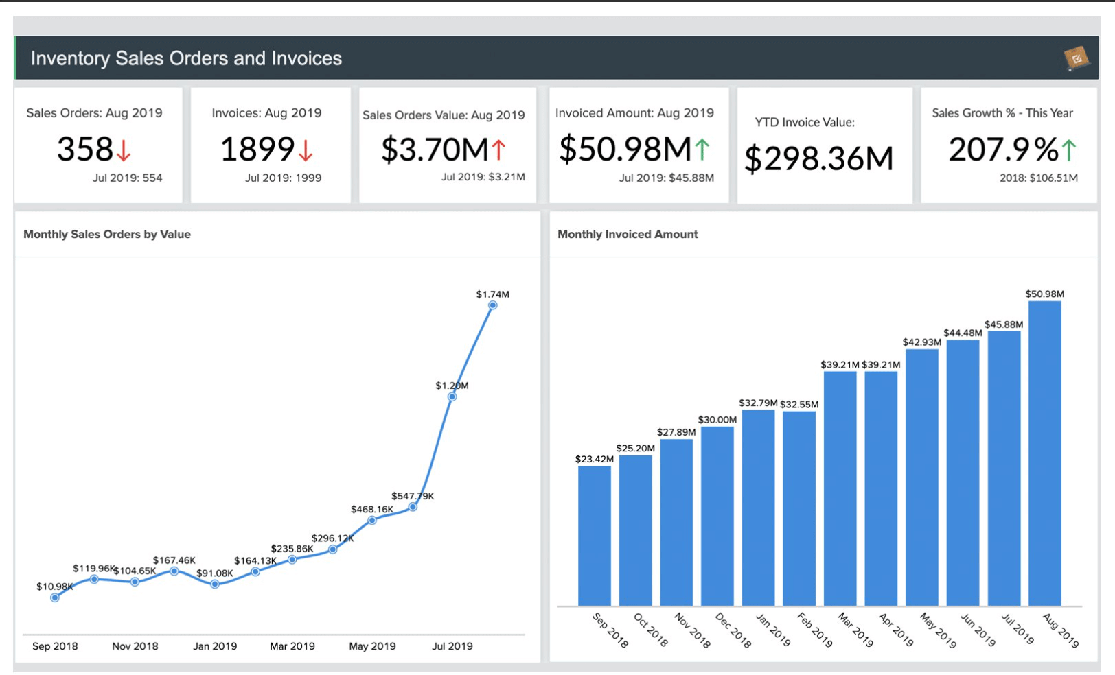
5. Power BI
Power BI is a business intelligence tool by Microsoft that allows users to create interactive dashboards and reports. It integrates with various data sources and provides advanced analytics capabilities.
Unique features:
- Natural language queries. Power BI offers a "Q&A" feature, enabling users to ask questions in natural language and receive visualizations as answers.
- Cortana integration. Users can use voice commands to query and explore data using Microsoft's digital assistant, Cortana.
- Power BI Mobile. It provides a dedicated mobile app for accessing and interacting with visualizations on smartphones and tablets.
Advantages:
- Integration with other Microsoft products and services.
- Wide range of data connectors and integration options.
- Powerful data modeling and transformation capabilities.
- Advanced analytics features, including machine learning integration.
- Sharing and collaboration options.
Disadvantages:
- Hard to use for complex data modeling and DAX language.
- Some advanced features require a premium subscription.
- Limited customization options for visual elements.
- Performance issues with large datasets.

6. Zoho Analytics:
Zoho Analytics is a cloud-based business intelligence and data visualization platform. It offers data preparation, analysis, and reporting capabilities for individuals and businesses.
Unique features:
- AI-powered insights. Zoho Analytics includes AI-powered features that automatically generate insights and recommendations based on the data.
- Embeddable dashboards. Users can embed interactive dashboards and reports into websites, applications, or portals.
- White-labeling. Zoho Analytics offers white-labeling options, allowing users to customize the branding and appearance of the platform.
Advantages:
- Integration with various data sources and cloud services.
- Easy-to-use drag-and-drop interface for creating visualizations.
- Collaborative features for sharing and collaborating on reports.
- Advanced analytics and statistical functions.
- Affordable pricing plans.
Disadvantages:
- Limited customization options for visual elements.
- Some advanced features require technical expertise.
- Performance issues with large datasets.
7. Looker
Looker is a data exploration and visualization tool that allows users to create interactive dashboards and reports. It focuses on providing a unified view of data from different sources and facilitates data exploration through a modeling layer.
Unique features:
- Data modeling layer: Looker focuses on creating a semantic layer that abstracts the underlying data sources, enabling users to explore and analyze data without needing deep technical knowledge.
- Version control: It provides version control capabilities, allowing teams to manage and track changes to data models and visualizations.
- LookML: LookML is Looker's proprietary language for defining data models, providing a powerful and flexible way to customize and extend data modeling capabilities
Advantages:
- Robust data modeling capabilities for creating a semantic layer.
- SQL-based query language for data exploration and manipulation.
- Collaboration features for sharing and discussing insights.
- Embedding options for integrating visualizations into other applications.
- Strong support for data governance and security.
Disadvantages:
- Requires additional knowledge due to the SQL-based approach.
- Limited customization options for visual elements.
- Some advanced features may require programming knowledge.
- Relatively higher cost compared to other tools.
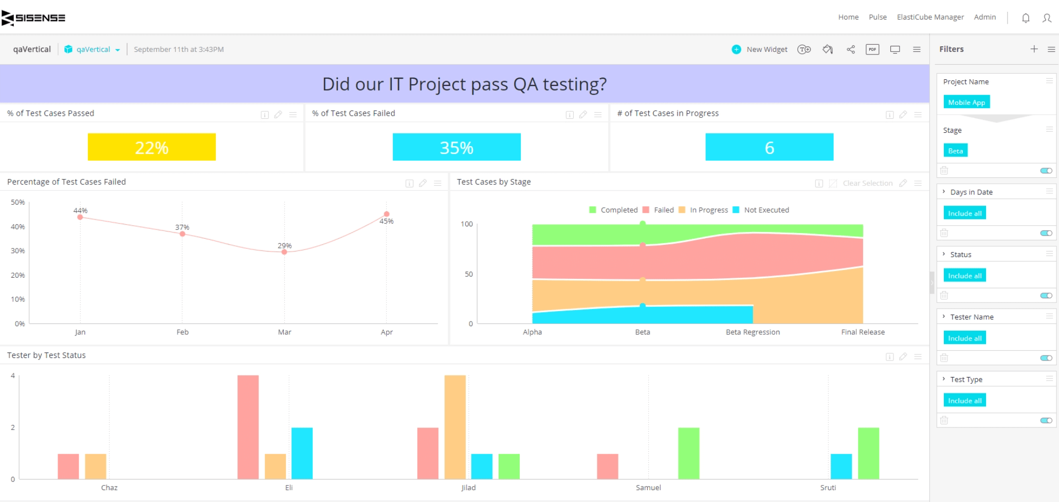
8. Sisense
Sisense is a business intelligence software that provides data visualization and analytics capabilities. It enables users to connect to various data sources, perform data modeling, and create interactive dashboards.
Unique features:
- In-chip data processing. Sisense uses in-chip technology to process and analyze data directly within the computer's memory, resulting in faster performance.
- Single-page architecture. It allows users to build complex dashboards with multiple visualizations on a single screen.
- AI-powered analytics. Sisense incorporates AI algorithms to automatically detect patterns, anomalies, and trends within the data.
Advantages:
- Fast and efficient data processing, even with large datasets.
- Drag-and-drop interface for easy dashboard creation.
- Embedded analytics and white-labeling options for customization.
- Advanced analytics features, including AI-powered analytics.
- Collaboration and sharing features for team collaboration.
Disadvantages:
- Limited customization options for visual elements.
- Some advanced features may require technical expertise.
- Higher pricing compared to other tools.
- Limited support for real-time data streaming.
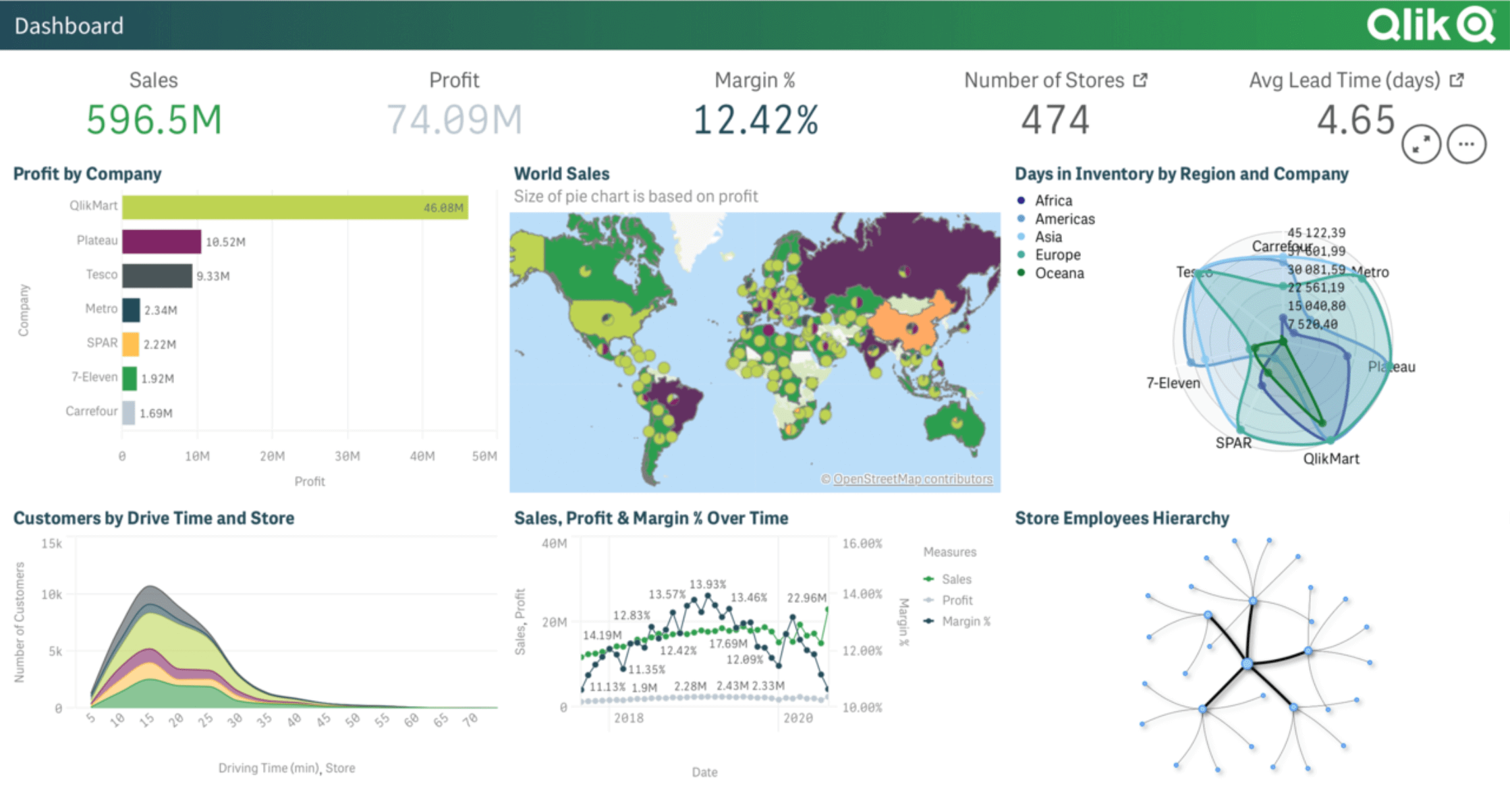
9. Qlik Sense:
Qlik Sense is a self-service data visualization and discovery tool that allows users to create interactive visualizations and dashboards. It focuses on associative data exploration, enabling users to freely navigate and discover insights.
Unique features:
- Associative data model. Qlik Sense employs an associative data model that allows users to make dynamic associations between data points.
- Insight advisor. It offers an insight advisor that suggests relevant visualizations and insights based on the selected data.
- Multi-cloud deployment. Qlik Sense provides deployment options across multiple cloud platforms, enabling flexibility and scalability.
Advantages:
- Associative data model for flexible and intuitive exploration.
- Drag-and-drop interface with responsive and interactive visualizations.
- Collaboration and sharing capabilities.
- Strong integration with various data sources.
- Robust data security and governance features.
Disadvantages:
- Non-intuitive interface for complex data modeling and expressions.
- Limited customization options for visual elements.
- Limited advanced analytics capabilities compared to other tools.
- Performance issues with large datasets.
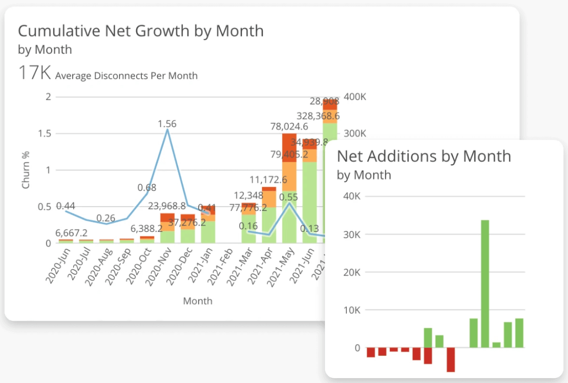
10. Domo
Domo is a cloud-based business intelligence and data visualization platform that provides a range of analytics and reporting features. It allows users to connect to various data sources to create visualizations.
Unique features:
- Magic ETL. Domo's Magic ETL (Extract, Transform, Load) feature simplifies the process of connecting, transforming, and preparing data from various sources without requiring complex coding or scripting.
- Domo Everywhere. Users can embed Domo's visualizations, dashboards, and reports into other applications, websites, or portals using Domo Everywhere, allowing for seamless integration.
- Alerts and notifications. Domo provides automated alerts and notifications based on predefined thresholds or conditions, informing users about important changes or anomalies in the data.
Advantages:
- Wide range of data connectors for seamless data integration.
- Drag-and-drop interface for easy dashboard creation.
- Collaboration features for sharing and discussing insights.
- Mobile-friendly dashboards and real-time data updates.
- Extensive library of pre-built connectors and templates.
Disadvantages:
- Relatively higher cost compared to other tools.
- Limited customization options for visual elements.
- Requires extensive knowledge of complex data modeling and calculations.
- Performance issues with large datasets.
As you reached the end of this article, we hope it has provided you with insights into the most popular software for data storytelling. Each of the tools offers unique features for different needs and preferences.
Remember, the choice of a data visualization tool is just the beginning of your journey. To truly use the power of these tools, it's essential to continuously evolve your visualization skills. You need to stay up-to-date with emerging trends and experiment with new techniques.
We hope this article has inspired you to embark on your own data visualization journey. Remember, the power to transform complex data into meaningful visual representations is in your hands. So, explore the vast possibilities of data visualization tools, and let your insights shine brightly.
Happy visualizing!
*ELVTR is disrupting education by putting proven industry leaders in a virtual classroom with eager rising stars. ELVTR courses offer 100% instructor driven content designed to give you practical knowledge within a convenient time frame. Choose the right course for you!