- MAIN PAGE
- – elvtr magazine – HOW TO DESIGN AND BUILD A GREAT DASHBOARD
HOW TO DESIGN AND BUILD A GREAT DASHBOARD

Dashboards make complex data clear and visually engaging. They should be easy and user-friendly, making it simple to understand data and insights without technical expertise or extensive training.
Data visualization is crucial for anyone who works with data, from business analysts to researchers and beyond. If you tried to build dashboards, but they don’t seem professional or lack visual uniqueness, don’t worry. Data visualization is a skill you can obtain with enough knowledge and practice.
Here are the main advantages of using dashboards:
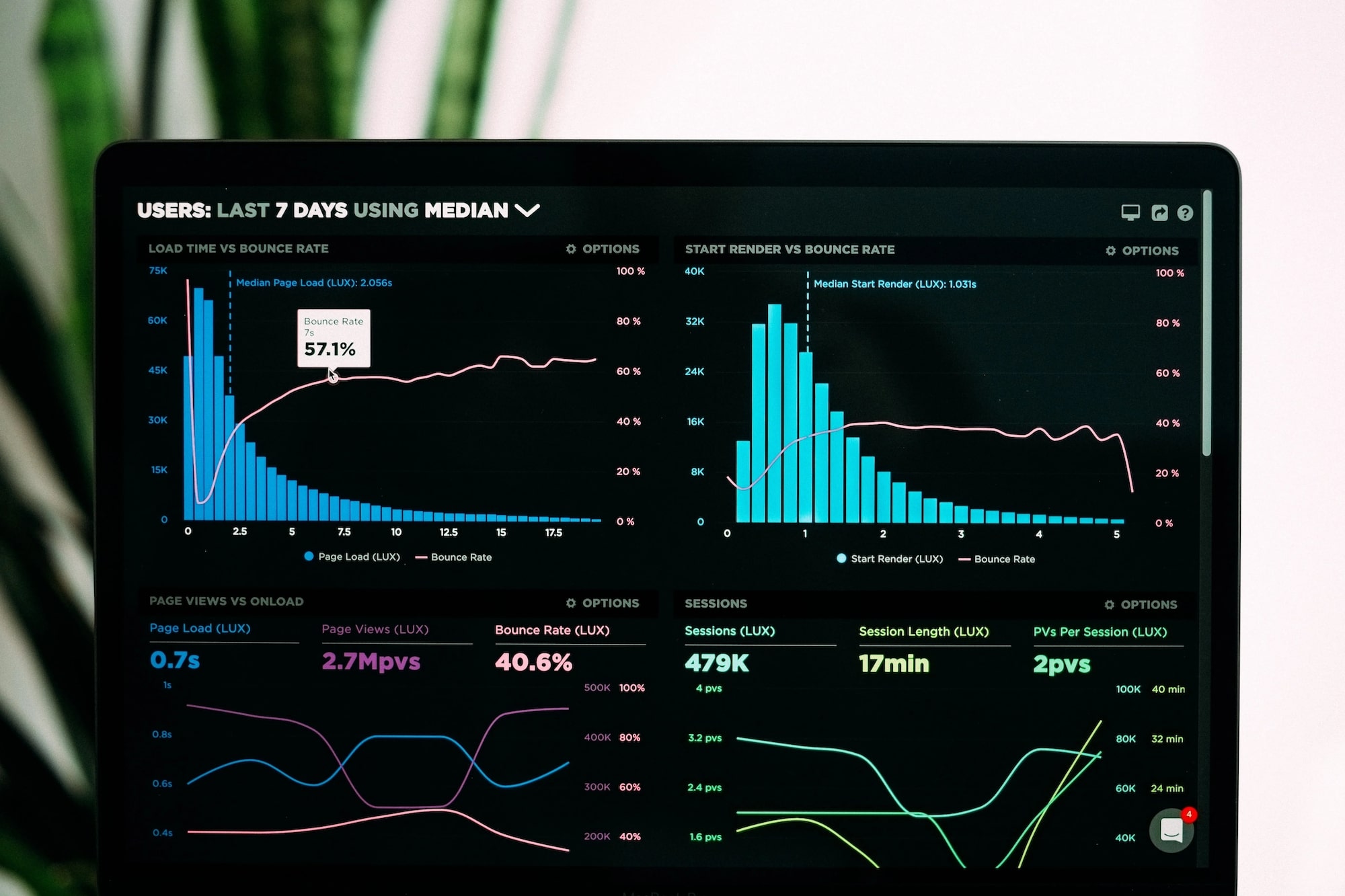
- Dashboards provide real-time visibility of KPIs and metrics, allowing you to monitor performance and track progress.
- Data visualization makes identifying patterns, trends, and relationships within large datasets easier.
- Dashboards improve data-driven decisions, leading to more informed conclusions and better outcomes.
- They can be shared across teams and departments, promoting collaboration and making it easier to work toward common goals.
- Developing dashboards saves time by reducing the effort required to gather and analyze data.
In this article, we will explain how to build dashboards and give you some tips. Below, we will provide a dashboard guide and explain data visualization processes. Follow these steps to create a professional dashboard:
1. Know your audience
When you build a dashboard, your target audience determines what message you need to convey. Ensure you understand their priorities and what content will appeal to them.
Discover who will use the dashboard and their needs and preferences. They may include executives, managers, analysts, or other stakeholders. Think about the level of detail and complexity that is comfortable for your audience. Consider their level of knowledge and expertise. You might need to adjust the quantity of data you present in your dashboard based on their familiarity with the subject.
Your goal is to make the dashboard easy to understand for people who are less proficient in the subject matter than you. Conduct user research to understand your audience's needs and preferences. This can include surveys, interviews, and usability testing.

2. Define your goals
Start by understanding what your organization wants to achieve. This could be anything from increasing sales, improving customer satisfaction, reducing costs, or increasing efficiency. Your dashboard should be designed to help you achieve these objectives.
Ensure that your goals align with your audience's needs. Your dashboard should provide insights that are relevant and actionable for your audience. Use your audience's feedback to refine your goals and ensure your dashboard is effective.
Use S.M.A.R.T. (specific, measurable, achievable, relevant, time-bound) goal parameters to evaluate your goals. Consider adjusting them if they fail to correspond with one of the parameters.

3. Choose data sources
Once you've identified your goals and audience, determine what data sources you need to use to support those goals. This may include data from spreadsheets, databases, APIs, or other sources. Make sure to validate your data sources for accuracy and reliability.
Don't rely on a single data source for developing a dashboard. Instead, gather data from multiple sources to ensure you get a comprehensive view of your business performance. This might include data from your CRM, marketing automation platform, website analytics tools, financial systems, etc.


4. Determine KPIs
Determine the KPIs that will best support your goals and audience. KPIs are measurable values that demonstrate how well a company achieves its objectives. They can be financial or non-financial, such as customer satisfaction, revenue growth, or employee turnover.
Once you have identified your objectives, you need to determine what data is relevant to those objectives. For example, you can track sales data or conversion rates if you are trying to increase revenue.
You may have access to a lot of data, but not all of it is equally important. Prioritize the most important metrics that directly impact your business objectives. These will be your KPIs.
Making your own dashboard means you might change the KPIs you have chosen at some point. When a business adjusts its objectives, you will probably need to modify the selection of metrics you track as well. Too many KPIs can be overwhelming and make it difficult to track progress. Keep your KPIs simple and focused on your primary objectives.

5. Pick a design layout and color scheme.
The visualizations you choose to build dashboards should help users understand your data quickly and easily. The layout and color scheme should be intuitive and visually appealing. Use a clear layout to help your audience navigate the dashboard. A color scheme should be easy on the eyes and support the overall theme. Avoid clutter and unnecessary elements that may distract from the data.
A grid system can help you organize your dashboard into sections. Use a consistent column width and row height to create a balanced and organized dashboard. Make sure that the most critical data is the most prominent. Use size, color, and placement to highlight the most important data points.
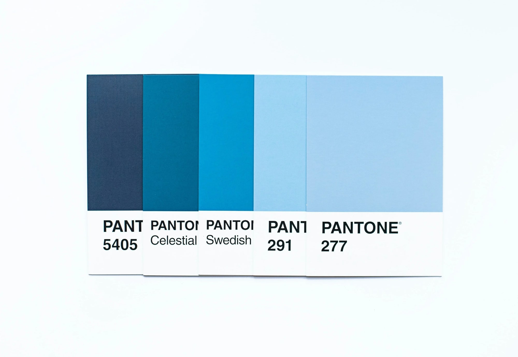
The chosen color scheme can significantly impact the readability and visual appeal of your dashboard. Choose visually pleasing and easily readable colors. Use contrasting colors to highlight important data points. Avoid using too many colors - it may be overwhelming.
Icons and images can help users quickly identify data points, but they can also add clutter to your dashboard. Use them sparingly and only when they add value to the user experience.
6. Add interactivity and filters.
Adding interactivity and filters when building dashboards can help your audience engage with the content and drill down into the data. This can include dropdown menus, sliders, and search boxes. Make sure to test your interactivity and filters to ensure they work properly.
Filters allow users to refine the data based on specific criteria, such as date ranges, regions, or product categories. This makes it easier for users to focus on the most relevant data.
Drill-down functionality lets the audience explore the data more thoroughly by clicking on specific data points or categories. This can help users identify trends or patterns that may not be immediately visible. Interactive visualizations, such as charts and graphs responding to user input, can help users explore the data more deeply. For example, users can hover over data points to see more information or click on a chart section to filter the data.
Interactive dashboards should provide context for the data being displayed. You can do this using annotations, labels, or supporting text explaining the presented data. Dashboards can be even more interactive if they include alerts or notifications that notify users when specific thresholds or targets have been reached.
7. Test and edit
Once you have built your dashboard, test it with your target audience and gather feedback. Use this feedback to improve your design. Keep testing and iterating until you have created a dashboard that meets your goals and audience's needs.
Collect feedback from people who use your dashboard. Ask them what they like, don't like, and what improvements they would appreciate. Use the feedback and data you have gathered to refine the visualizations in your dashboard. Make changes to the layout, color scheme, and data labels to make it more intuitive and easy to use.
After adjusting your dashboard, test it again to see if the changes have improved the user experience. Repeat this process until you have a dashboard that meets your objectives and provides value to the users.

Bonus advice
Now that you know how to develop a dashboard, here is some additional advice for more experienced readers:
- Keep your dashboard simple. The less data you include, the better. The art of creating dashboards lies in minimizing and prioritizing.
- Use consistent colors and fonts. You might want to experiment with your visual style, but it’s better to stick to classic color schemes and font combinations. Just look up color and font pairs before creating a dashboard to save time.
- Use storytelling. Build your dashboard like a story that takes the user on a journey. Show how different data points connect and contribute to the bigger picture.
- Incorporate gamification. Use elements like leaderboards, badges, and challenges to encourage users to interact with the data and compete with each other.
- Include data simulations. Use interactive simulations that allow users to adjust different variables and see the impact on the data in real-time.
- Use data art. Create colorful charts and graphs, use interactive animations, and experiment with creative layouts to make your dashboard memorable.
- Build a data ecosystem. Rather than creating a single dashboard, build a data ecosystem with multiple dashboards and data sources.
- Use AI and machine learning. AI and machine learning can help you build personalized and dynamic dashboards. Use algorithms to make real-time recommendations and predictions based on user behavior and data analysis.
In today's data-driven business environment, effectively visualizing and communicating data insights is a critical skill. Building effective dashboards and visualizations requires careful planning, attention to detail, and a deep understanding of the presented data.
*ELVTR is disrupting education by putting proven industry leaders in a virtual classroom with eager rising stars. ELVTR courses offer 100% instructor driven content designed to give you practical knowledge within a convenient time frame. Choose the right course for you!